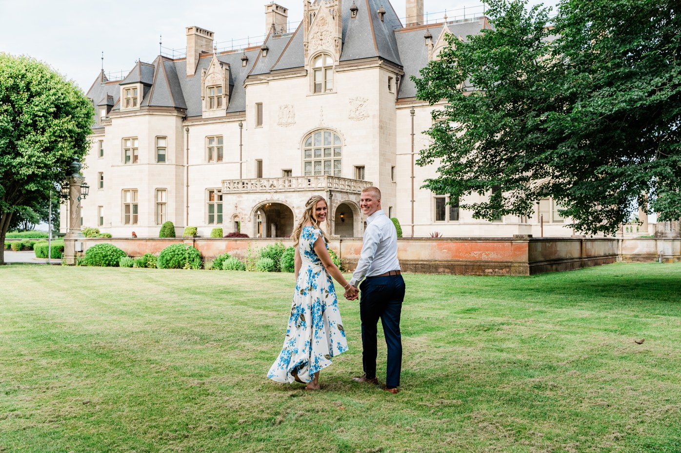
A wedding gallery moves through several kinds of light before the day is over. Quiet preparation photographs, portraits in a warm interior, a church aisle and a colorful dance floor all belong to the same story. The editing needs to connect those scenes while keeping each one recognisable.
This case study follows a selection from one wedding photographed by Michele Maloney, with editing by InPix.Me. The comparisons show how the finished photographs relate across the day. They also show why evaluating an editing partner on a single outdoor portrait can leave much of the real work unseen.
Photography: Michele Maloney Photography. Editing: InPix.Me. All photographs shown below come from the same wedding.
Getting ready: small details and natural skin tones
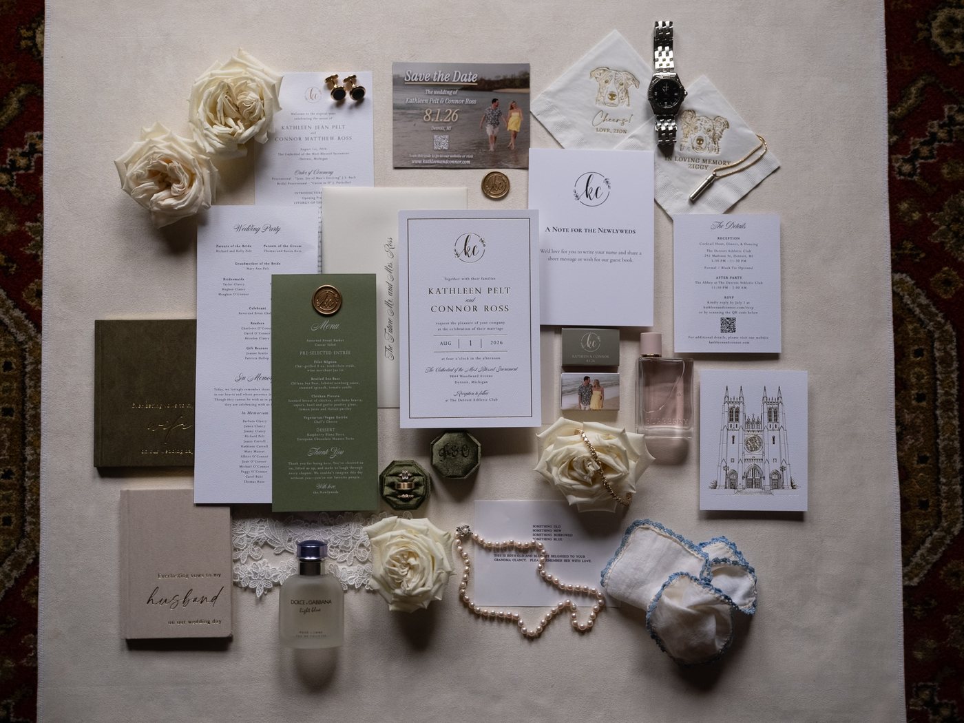
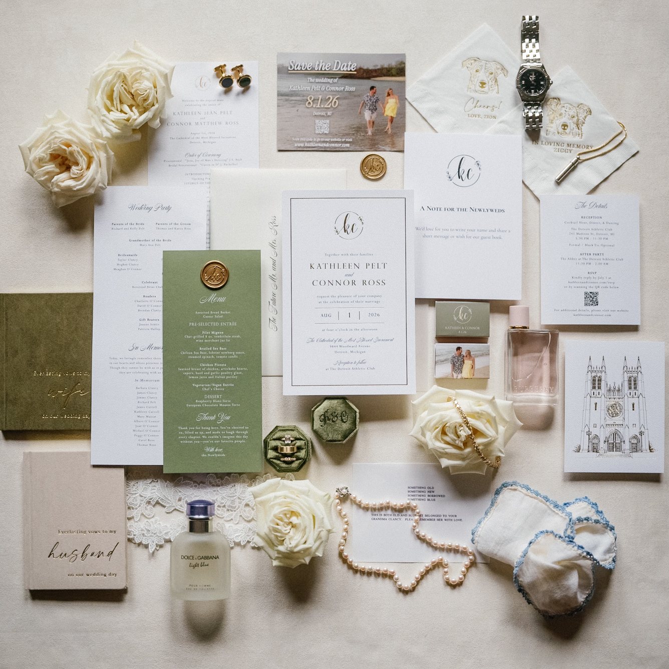
The opening photographs establish the visual language of the gallery. In the invitation flat lay, the finished image makes the pale paper, flowers and accessories easier to read together. The crop changes, too: the final composition is square, so the comparison includes both full versions rather than forcing them into identical frames.
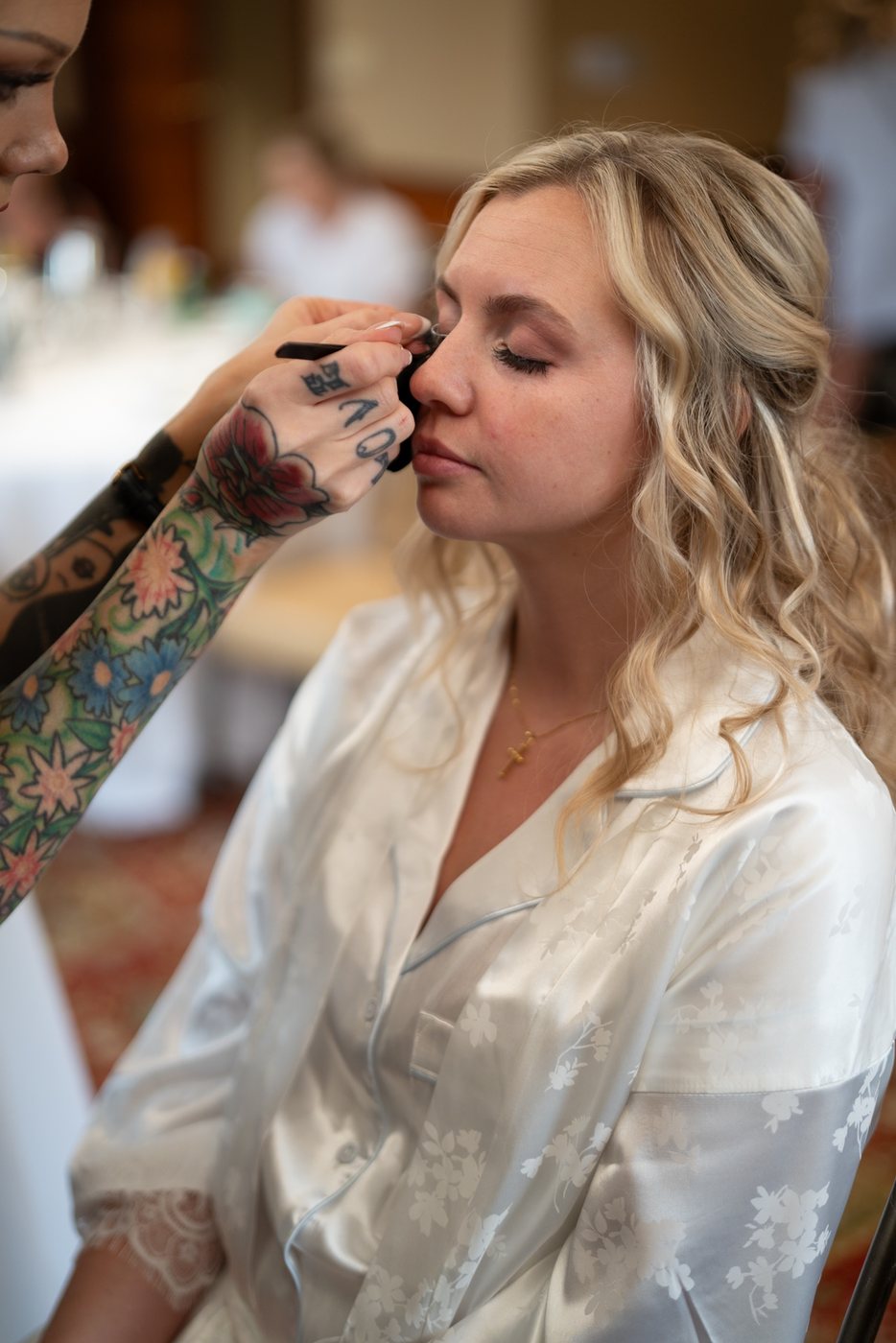
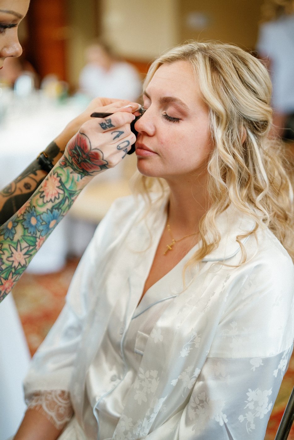
The bride’s preparation portrait calls for a quieter change. Her face is lighter in the finished photograph, with a softer relationship between skin, hair and the pale robe. It is a useful reminder that a successful edit does not always need a dramatic transformation. Small decisions matter when those photographs sit beside the rest of the wedding.
Interior portraits: keep the room’s character
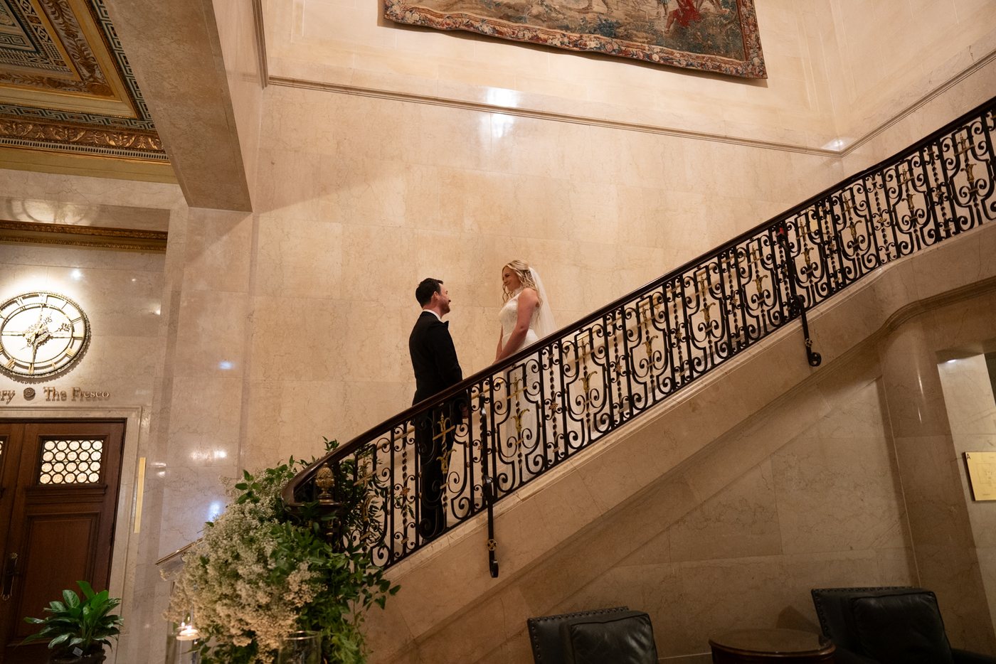
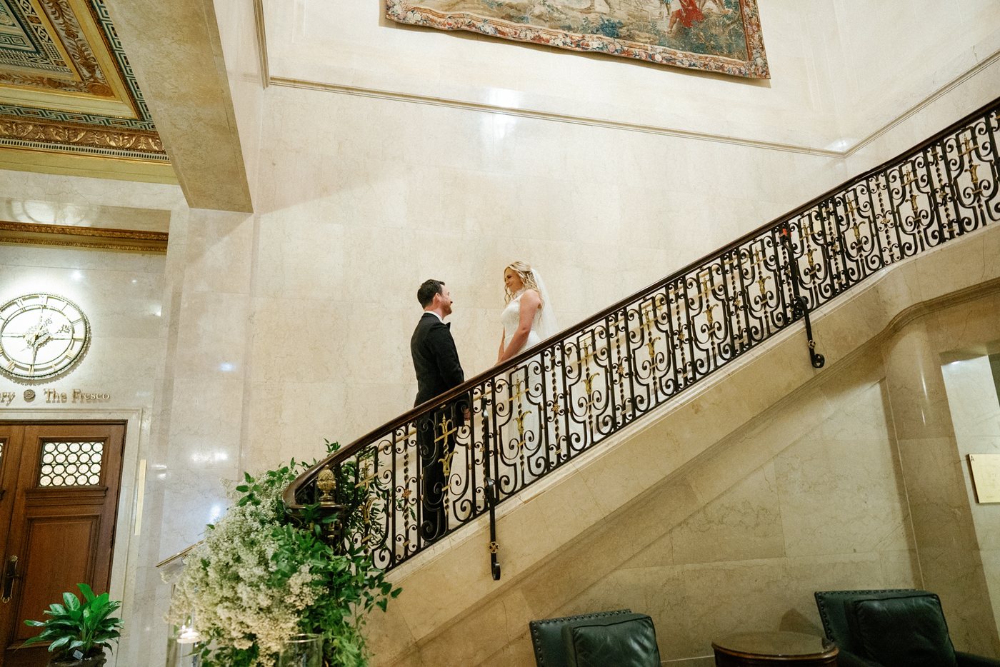
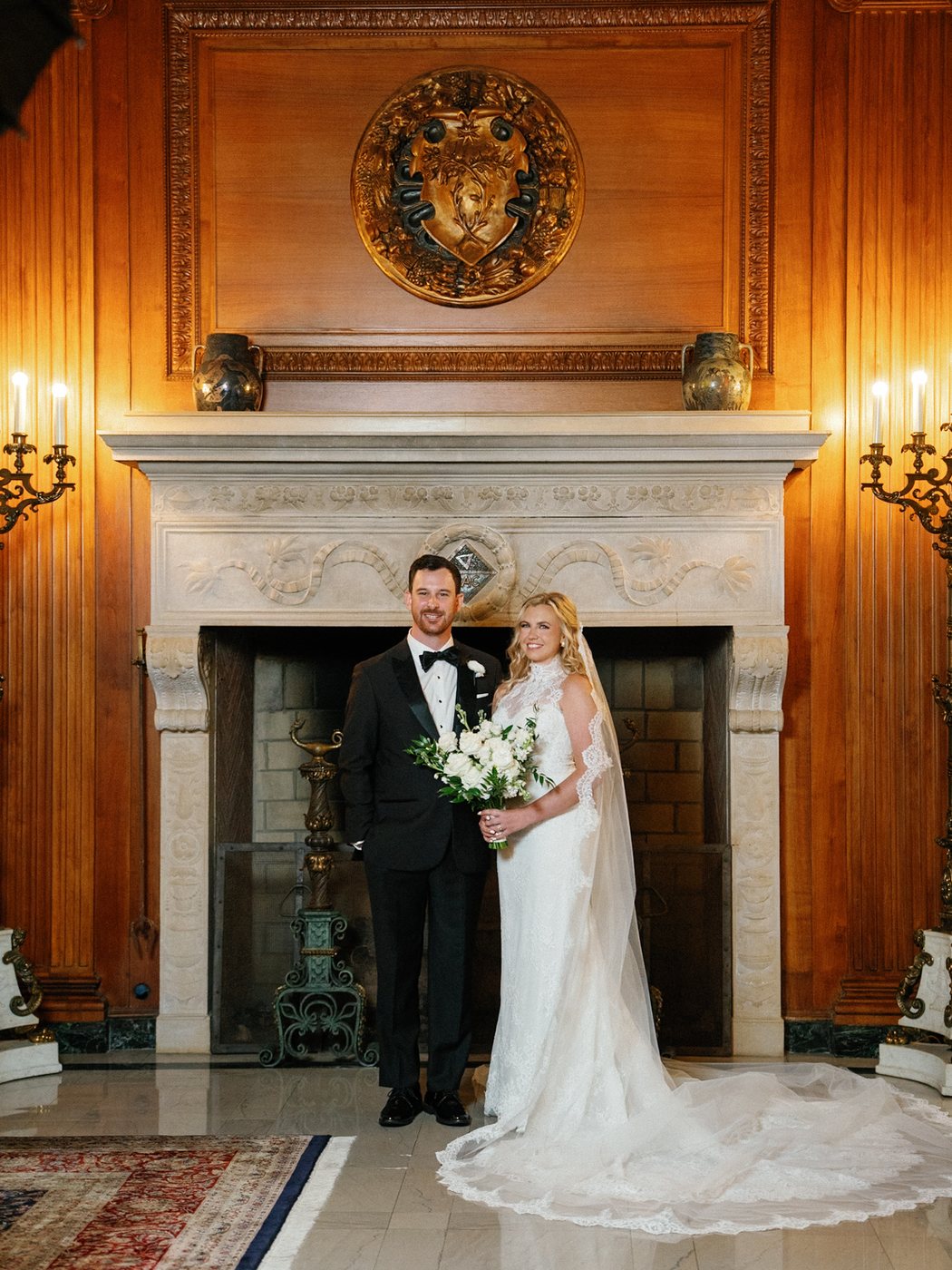
The staircase and fireplace portraits introduce warm stone, wood and darker clothing. In the staircase photograph, the finished version has a lighter, less amber appearance. The surrounding architecture remains part of the portrait; the couple does not need to be separated from it by making every surface equally bright.
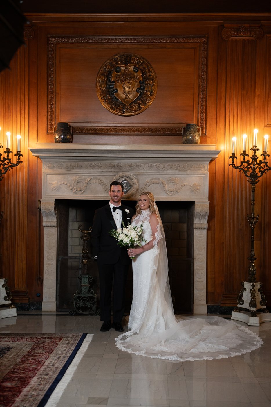
The fireplace portrait keeps more of the room’s warmth. The couple, the dress and the dark suit are clearer, while the wood and warmly lit setting still feel warm. The final framing is also tighter. These two scenes illustrate the distinction between a coherent gallery and an identical color treatment applied everywhere.
The church: connect faces, clothing and the wider scene
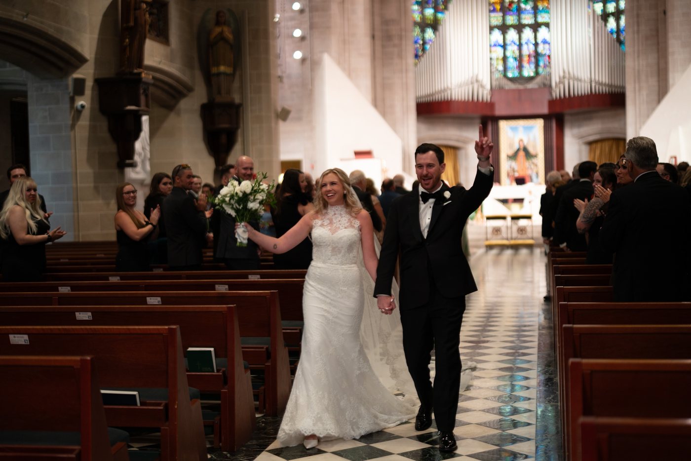
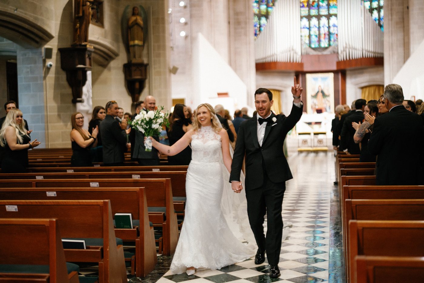
As the couple walks through the church, the frame includes people in the pews, bright areas at the back and darker surroundings. The finished photograph brings more attention to the couple without removing the depth of the interior. Look at the faces, the white dress and shirt, and the relationship between them and the room.
For a photographer reviewing a large wedding gallery, this is an important kind of frame to include in an editing trial. A close portrait cannot show how an editor handles people inside a wider scene.
Reception details: brightness without losing atmosphere
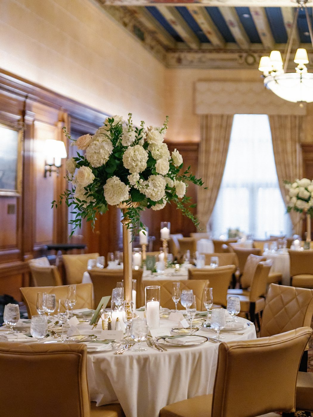
The reception photographs shift the attention from people to flowers, glassware and the room itself. The table detail becomes much easier to read after editing. Pale flowers and linens have more separation from the surrounding shadows, while the warm character of the room remains visible.
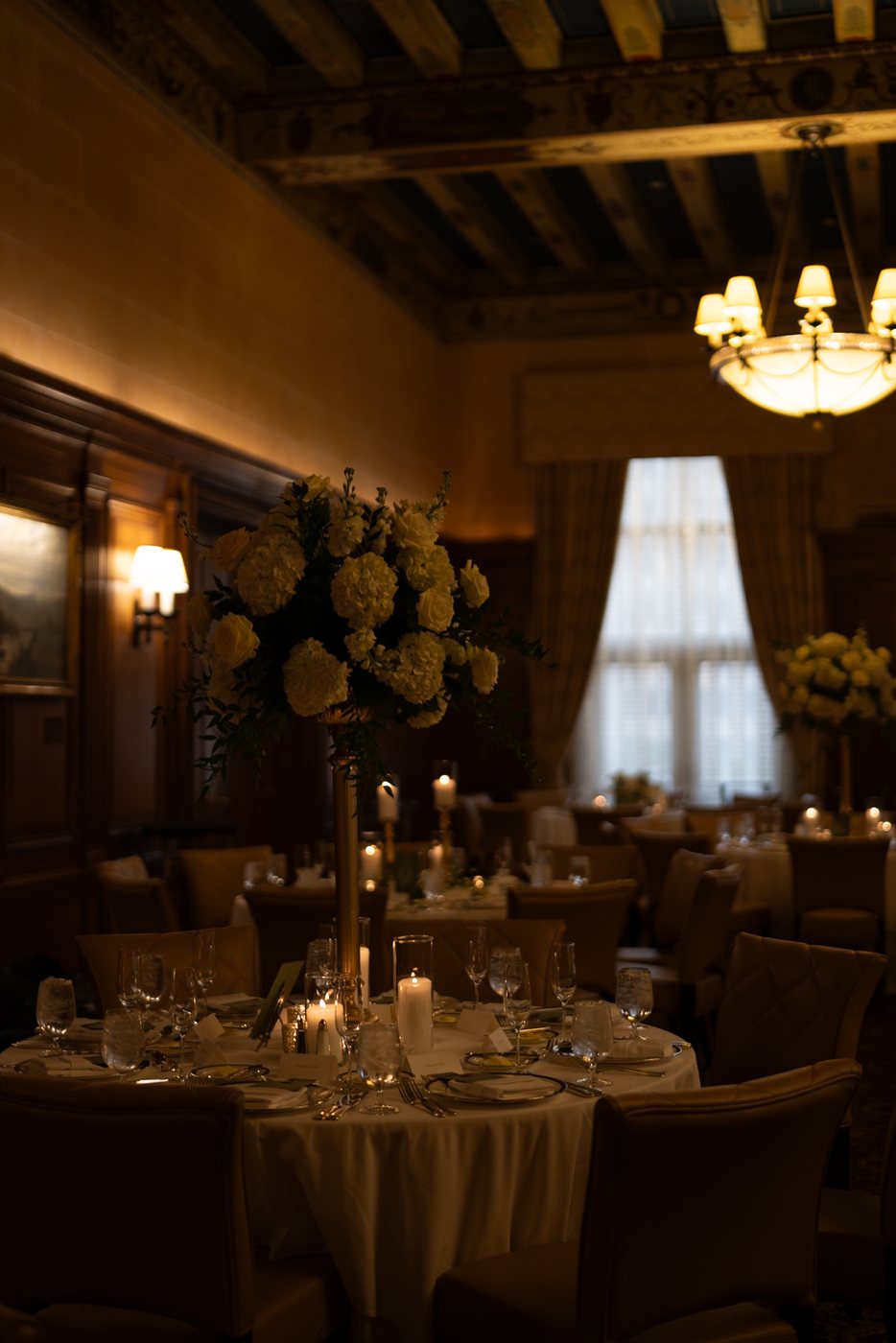
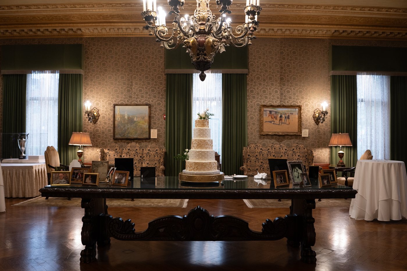
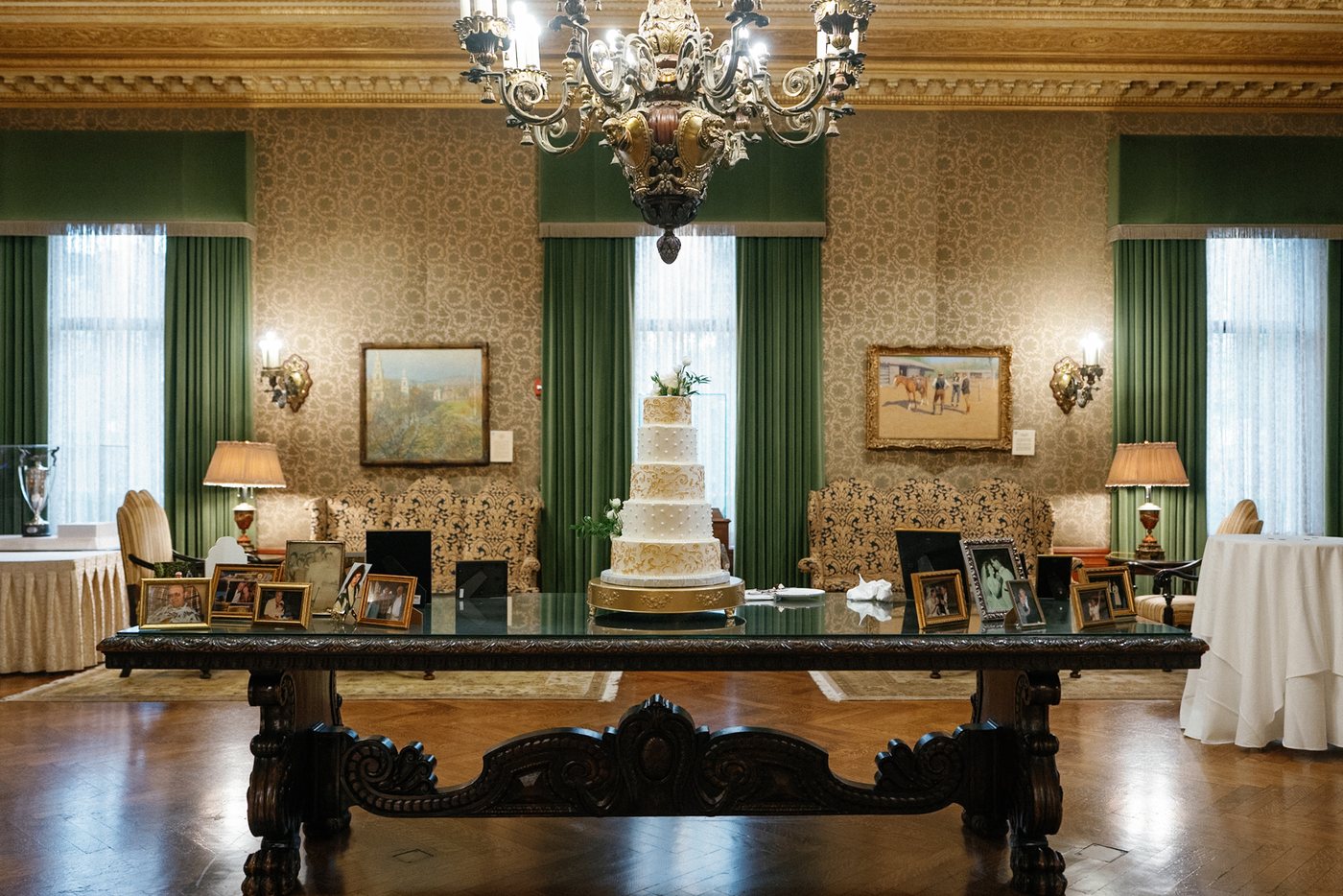
The wider room photograph provides another view of that finish. The windows, tabletop, wood and darker floor all contribute to the atmosphere. A gallery needs these wider photographs as well as close details: viewers should be able to move between them without feeling that they belong to different weddings.
Outdoor portraits: adapt to a cooler starting point
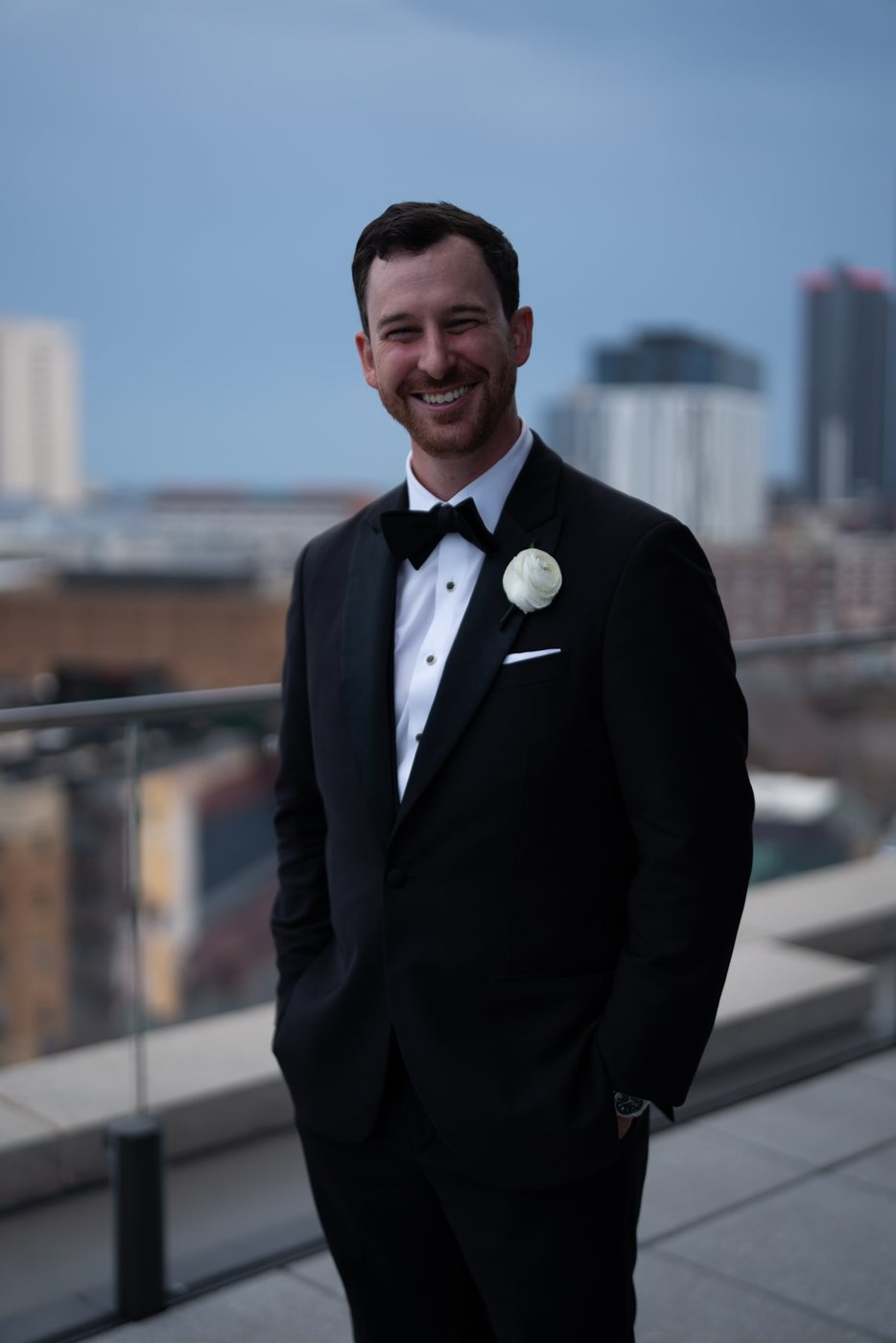
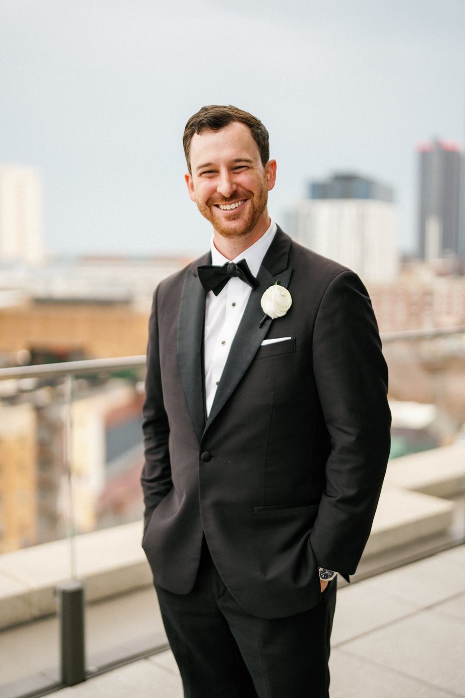
The rooftop portrait starts with a much cooler appearance than the interiors. In the finished image, the groom’s face is brighter and warmer, and the suit reads differently against the city background. This is one of the clearest comparisons in the set.
It also shows why the same adjustment cannot do every job. The staircase, the reception and this outdoor portrait begin in different places. The useful connection is in how the finished skin, clothing and overall brightness relate, rather than whether each scene has the same background color.
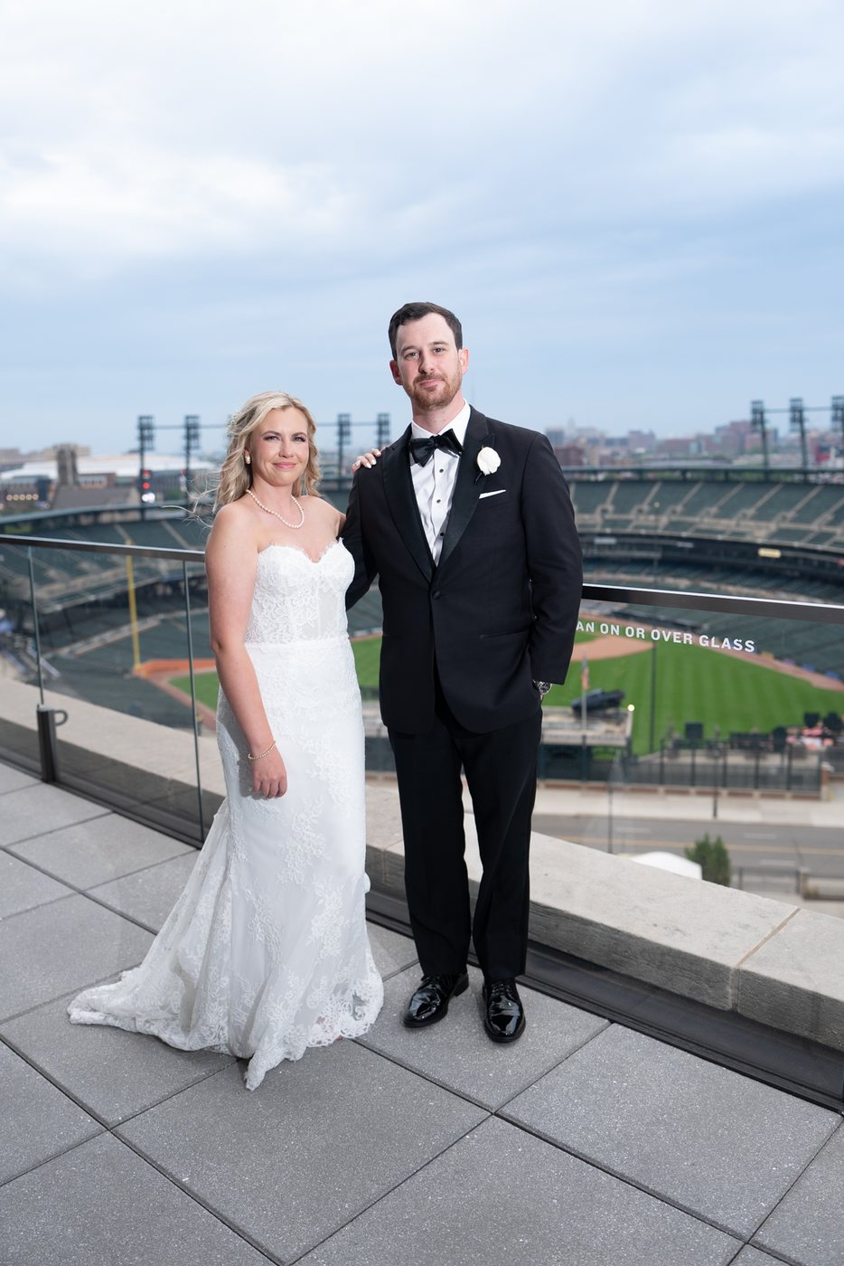
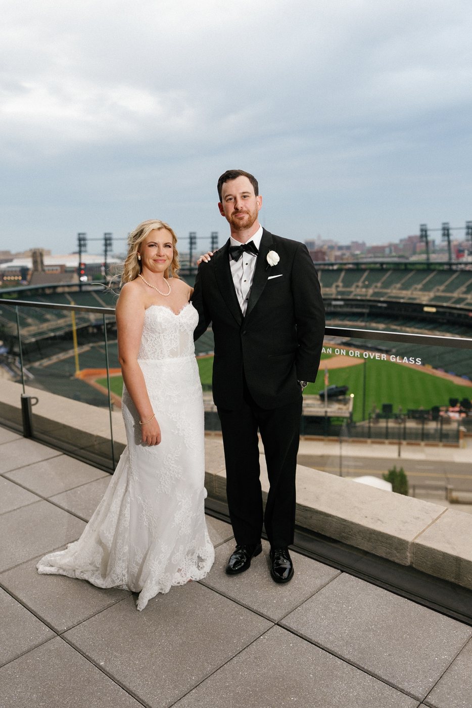
The couple’s portrait overlooking the stadium gives a wider view of the same evening setting. The finished frame has warmer skin and a different balance between the white dress, dark suit and sky. The stadium remains part of the photograph rather than disappearing behind the couple.
The dance floor: retain the energy of the light
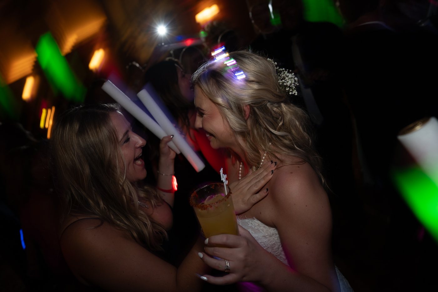
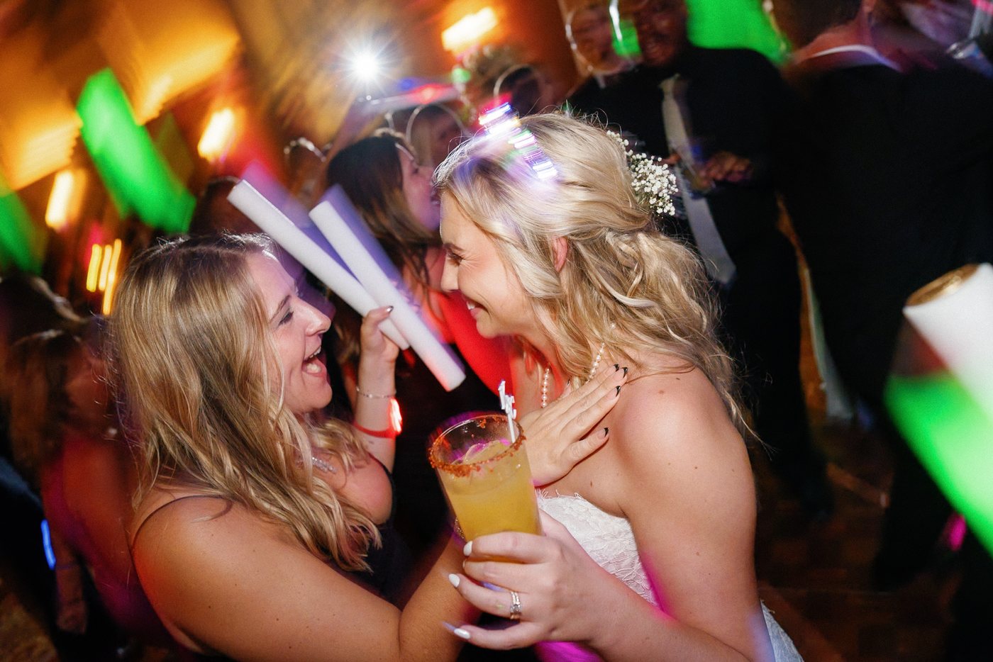
The final comparison has a different priority again. The original frame is dark, with strong colored lights around the people. The finished photograph makes the faces and interaction easier to see, while keeping the red, green and warm highlights that give the scene its energy.
The dance floor should still feel like the dance floor. Making it resemble the earlier preparation portrait would lose something important about the moment.
What to take into your own editing trial
Choose photographs that represent the whole job: preparation, indoor portraits, the ceremony, reception details, outdoor portraits and evening light. Include two neighboring frames, and make any cropping preferences clear. Our editing trial guide explains how to build that selection; our style guide checklist helps you communicate the finish you want.
At InPix, personally edited galleries are guided by the photographer’s references and preferences. Start with up to ten free sample edits to see how that approach fits your photographs, then review a full gallery before increasing the workload.
Spend Less Time in Lightroom & More Time Behind the Camera
InPix.Me pairs you with a dedicated human colorist to match your film scans or apply your favorite presets for just $0.20 per image.
See our before-and-after wedding editing samples and editing services and prices to plan your next gallery.